What it Means and Why it Matters
It seems corny to be talking about our logo, but the truth is we put a lot of thought and effort towards ensuring it would represent our brand well. People comment all the time about how much they like it and a few have asked me about the thought process behind it. I thought I’d go ahead and share a bit on that.
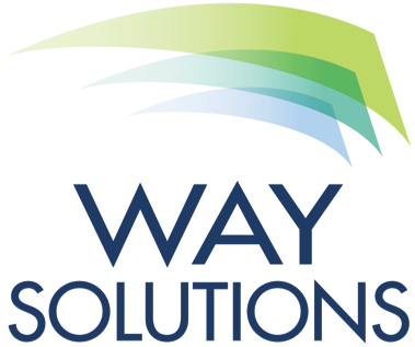
First, our color palate. Our branding colors were chosen to elicit an organic sense without being too “tree hugger”—not that we don’t love trees. We didn’t want to be mistaken for an environmental company, though in reality we are working with one of our most precious resources—people. We wanted our color palette to acknowledge that in some way without being overly dominant.
We also wanted a set of “happy” colors. Too often, work talk gets too heavy and corporate; it can feel overwhelming. We wanted to remind people that while it takes work to achieve results, it doesn’t have to be that hard. We focus on elegantly simple solutions that create big rewards. Rewards are what give us the energy to keep plugging during hard periods or moments. The “happy” colors remind us to celebrate the wins so that we’ll continue to pursue greater challenges.
Next, 3 colors for 3 audiences. The 3 dominant colors we use most often are green, aqua, and deep blue. We serve 3 different audiences with what we do: individuals, HR professionals, and managers. We picked a color for each.
Green is the color that represents the individual in the Way Solutions world. It’s for all of the people who want more from their work experience; for those who want to proactively manage their career. You’ll notice our products that are individual-focused are branded primarily with the color green.
Aqua blue represents the Human Resources audience. They often serve their employer by serving the individuals who work there, so we gave them a color that blends blue and green together.
Deep blue represents employers, typically represented by their hiring managers. Any of our products that are designed to speak primarily to the manager audience are branded in blue. This colorizing helps us keep everything straight and we hope it keeps it sorted in your mind too.
Finally, leading with flags. Our logo references the flag shape because we focus on leading leaders. We believe fundamentally that it’s time for work to evolve. In order to change how we think about work, we need leaders in every category of our audience to come together and unleash greater creativity, greater results, and offer their best to the world we live in.
Call us idealists, but we think people who understand how to work together, who take responsibility for themselves and their career, and represent their companies well can do big things.
It’s a movement. Join us. Work can work better. We just wanted to say all that in a logo.
What does your company’s logo represent?

